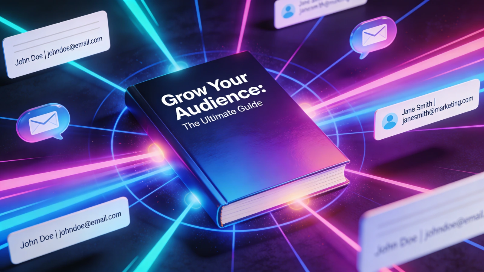
Most lead magnets fail. Not because the content is bad. Because the offer is forgettable.
"Subscribe to our newsletter" converts at about 1-2%. "Get our free ebook" does slightly better. But the lead magnets pulling double-digit conversion rates? They share specific traits. As Liam Bartholomew, VP of Marketing at Cognism, put it: "Sometimes you see a great tagline, and you give your details for an eBook that consists of five points you already know." That's the bar you're competing against. People have been burned. Your offer needs to be worth the email.
According to GetResponse's lead magnet research, 58.6% of marketers report that short-form written content like checklists and templates outperforms long-form guides. And industry research on interactive content shows that interactive tools like quizzes achieve 40% conversion rates on average, far outpacing static content formats.
Here are 11 lead magnet types that actually work in 2026, with examples you can copy.
1. The Specific Number Report
People love data they can use in their own work. The kind of stat you cite in a meeting to look like you did the research.
Example: "2026 Marketing Budget Benchmarks: What 847 Companies Are Actually Spending"
Notice the specifics: 847 companies, not "hundreds." Current year. The word "actually" implying insider truth vs. public data. Anyone planning a budget needs benchmarks, and that urgency drives sign-ups. Marketers report these converting in the 15-25% range on targeted traffic, though results vary widely by audience.
The key is original data. Repackaging publicly available stats won't work. Survey your customers, analyze your platform data, or partner with a research firm. The exclusivity is the value.
2. The Industry Comparison Chart
Buying decisions require comparisons. If you make the comparison for them, they'll trade an email to avoid hours of research.
Example: "CRM Software Comparison: 12 Platforms Ranked by 37 Features"
Twelve platforms covers the market. Thirty-seven features means no skimming over important differences. This would take a week to research manually, and that saved time is what they're paying for with their email address. For bottom-of-funnel buyers who are actively shopping, marketers report these pulling some of the highest conversion rates of any lead magnet type.
One warning: keep it objective. The moment it reads like a sales pitch for your product, trust evaporates. If you sell one of the 12 platforms, be fair about your weaknesses. Readers will respect it.
3. The Template Bundle
Templates are the workhorse of lead magnets. No reading required. Download, customize, use.
Example: "The Complete Sales Email Template Pack: 47 Emails for Every Situation"
The number does the heavy lifting here. Forty-seven templates means they'll find what they need. "Every situation" promises they won't be left hanging. And unlike an ebook, templates are ready to use right now. Role-specific template packs tend to convert well, with some marketers reporting rates of 25-40% depending on how targeted the audience is.
But here's the catch: they have to be good. A mediocre template wastes the user's time. One genuinely useful template earns their trust and future attention. Include variety. A sales email pack should have cold outreach, follow-ups, objection handling, contract reminders, and renewal asks. Cover the full job.
4. The Pricing Guide They Can't Find Elsewhere
B2B pricing is deliberately opaque. Most vendors want you to "contact sales" so they can qualify and pitch. A pricing guide cuts through that, and the frustration behind the search is what makes these convert so well.
Example: "2026 SaaS Pricing Benchmarks: What 200 B2B Companies Actually Charge"
This works because it addresses a real, common frustration: why won't anyone tell me what this costs? It's useful for budget planning, useful for benchmarking your own pricing, and useful for negotiating better deals. For a relevant B2B audience, these can be among the highest-converting lead magnets you'll create.
You don't have to reveal competitor pricing. Aggregate ranges, pricing models, common add-ons, and hidden fees all have value. The goal is helping them budget and negotiate.
5. The How-We-Did-It Breakdown
Generic advice is everywhere. Specific execution details are rare. That scarcity is what makes these convert.
Example: "How We Grew from 1,000 to 50,000 Email Subscribers in 18 Months"
Real numbers, not "grew significantly." A specific timeframe. A promise of a playbook, not just inspiration. Structure matters more than most people think. Don't just tell the story chronologically. Organize by tactic: what you did, why you did it, what worked, what didn't, and what you'd do differently. Include screenshots, actual data, real examples. The more specific, the more valuable.
6. The Certification or Assessment
This is where lead magnets get interesting. People want validation. A "score" or "certificate" gives them something to share, compare, and brag about.
Example: "Marketing Maturity Assessment: See Where You Rank vs. 500 Other Teams"
The conversion dynamics are different here. They're not giving an email for content. They're giving information (their assessment answers) and email for a personalized result. That changes the math. As Allie Decker, Head of Content at Omniscient Digital, noted: "Gating content is a powerful way to measure interest and better understand intent - but the intent isn't always to convert." Assessments solve this because the act of completing one signals genuine interest.
Research backs this up: Content Marketing Institute's 2025 benchmark study found that interactive assessment tools achieve 67% gating acceptance among B2B buyers, second only to research reports at 73%.
Keep the assessment short. 10-15 questions max. Any longer and completion rates tank.
7. The Swipe File
Example: "127 High-Converting Landing Pages (Analyzed and Organized by Industry)"
The huge number signals value. "Analyzed" means work has been done for them. Organized by industry makes it immediately relevant. These typically convert in the 20-30% range, based on what marketers report.
But the organization is what separates a useful swipe file from a time-wasting one. A random dump of 127 examples is overwhelming. Organize by use case, industry, goal, or style. Add a 2-3 sentence analysis of each: what makes it work, what to copy, what to skip.
8. The Private Community or Newsletter
Ongoing value instead of a one-time download. For some audiences, access beats assets.
Example: "Join 12,000 Marketers Getting the Monday Marketing Brief"
Social proof (12,000 others), a clear value prop (marketing brief), and a consistent cadence (Monday). These typically convert lower than one-time downloads, maybe 10-20%, but the subscribers they attract tend to engage more over time.
The catch: this only works if you deliver. A weekly newsletter that's just product updates will get unsubscribed fast. According to research from SilverPop and Demand Gen Report, lead nurturing emails get 4-10x the response rate of standalone email blasts, but only when the content delivers real value. Original insights, curated links, and practical advice earn opens. Thinly disguised promotions don't.
9. The Mini-Course
A "5-day email course" sounds more substantial than a "5-part email series" even though they're identical. Framing matters.
Example: "Content Strategy Crash Course: 5 Days to Your First Content Calendar"
Clear outcome, defined timeline, and "crash course" implies efficient rather than bloated. Structure each day with one lesson and one action item. Day 1: audit your existing content. Day 2: define your audience. Day 3: choose your channels. The action items are key. Information alone isn't that valuable. Information plus implementation is. These tend to convert in the same range as template bundles, but with the added benefit of building a multi-touch relationship before you ever pitch anything.
10. The Calculator or Tool
Example: "ROI Calculator: See What You'd Save by Switching Platforms"
Interactive beats static every time. A calculator that answers "what would this mean for MY business?" is more valuable than any generic projection. Personalized output, a specific decision it helps with, and a visual result they can share with their team.
The smart move: gate the result, not the tool. Let them input their numbers freely, then require email to see the full analysis. They've already invested time. The email ask feels like a small additional step, not a barrier. Include shareable outputs too. A PDF summary they can send to their boss. A comparison chart. Something that helps them make the internal case.
11. The Gated Flipbook
Example: A product catalog or industry report that's free to browse, but gated after the first few pages.
The partial access model works because it's fair. They see what they're getting. They confirm it's valuable. Then they decide whether to exchange their email. The preview builds interest before the ask, and the interactive format feels more valuable than a static download.
Research on content gating strategies shows that top-performing B2B companies use selective gating, keeping awareness content freely accessible while gating premium, decision-stage resources. This balanced approach generates higher-quality leads.
There's an extra layer here that other lead magnets don't have: engagement tracking. You don't just know they signed up. You know they read pages 1-15, spent 4 minutes on the pricing section, and came back twice. That's a qualified lead, not just an email address. This is how Flipbooker's lead generation works. Set which page triggers the gate, and capture emails from people who are actually interested in the content.
The Thread That Connects All of These
Look at the lead magnets that actually convert and you'll notice the same three things: a specific promise (not "helpful tips" but "47 templates"), a clear value exchange (they know what they're getting before they give the email), and immediate utility (they can use it today, not someday).
The switch from a generic "guide" to a specific "report with 847 companies' data" can make a real difference in your conversion rates. But getting the email is only step one. Qualifying that lead based on what they do next is where the value actually sits. If you want to see who's reading your content after they sign up, not just that they signed up, Flipbooker's lead generation tools are built for exactly that.