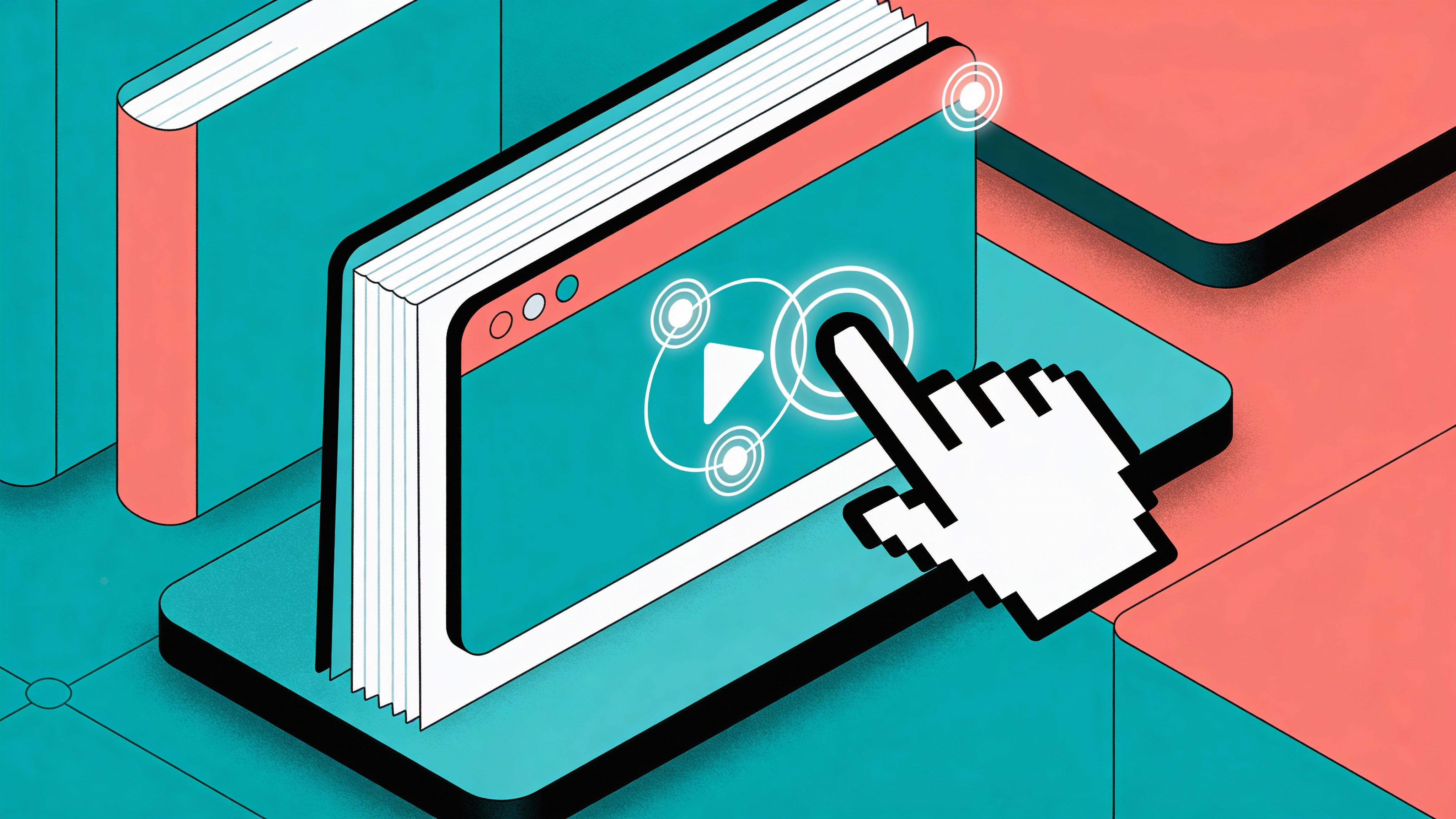
A flipbook without links is just a PDF with a page-turn animation. It looks nicer, sure, but the reader still can't do anything with it. They can't click your phone number to call you. They can't watch your product demo without switching tabs. They can't tap a spot on your floor plan and get square footage.
Adding interactivity changes the whole dynamic. The team behind The Modern Muse put it well: "Issuu allows our magazine to become interactive and readers can click on links to learn more about topics and shop brands we feature." That shift, from reading to clicking, is what separates a document people skim from one they actually use.
And the engagement data backs it up. Linearity compiled research showing interactive content gets 52.6% higher engagement than static formats, with readers averaging 13 minutes on interactive content versus 8.5 on static. The interesting part is why: every clickable element is a micro-decision, and decisions keep people awake. Scrolling is passive. Clicking is active.
This whole process takes about five minutes, and most of that time is spent deciding where to put things rather than figuring out how the tools work.
How Links Actually Work in the Editor
Open your project in the Flipbooker editor, grab the link tool from the toolbar (it's the chain icon on the left side), and draw a rectangle over whatever you want to make clickable. Could be a button you designed in your PDF, a phone number, an email address, an image of your storefront. The editor doesn't care what's underneath. You're just defining a clickable zone.
Once you draw the area, a popup asks where the click should go. You've got four options: a web URL, an email address (mailto:), a phone number (tel:), or another page inside the flipbook. Pick one, paste or type the destination, save, and you're done.
Where people mess up is the destination. They link their "Contact Us" button to the homepage instead of the actual contact form. They link a product image to the main catalog page instead of the specific product. Every link should land the reader exactly where they expected to go when they clicked. If they have to hunt after clicking, you've wasted the interaction. This sounds obvious, but go look at any digital brochure and you'll find at least one link that dumps you somewhere vague.
The other common mistake is discoverability. On desktop, you can add a hover highlight so the cursor changes when it's over a clickable area. That works fine. But phones don't have hover. If your readers are on mobile, and more than half probably are, they need a visual cue baked into the design itself. A small icon overlay, a colored border, text that says "tap here." Something. Otherwise your carefully placed links are invisible.
What About Videos?
Videos are simpler than links, honestly. Select the video tool, click where you want it on the page, paste a YouTube or Vimeo URL, and resize the placeholder to fit your layout. That's the whole process.
The decision that matters is whether to use autoplay. Most browsers block autoplay with sound, so even if you enable it, it won't work the way you imagine. Muted autoplay is technically possible but often annoying. A short silent loop on a cover page can work as an ambient background. Anything else, let the reader press play when they're ready.
One thing worth knowing: embedding from YouTube or Vimeo doesn't add to your flipbook's file size since the video streams from their servers. If you upload a video file directly to Flipbooker, that file size counts. Keep direct uploads short, 30 seconds or less if you can.
Hotspots Are Where It Gets Interesting
Links and videos are straightforward tools. Hotspots are more creative, and I think most people underuse them because they don't immediately see the application.
A hotspot is an invisible clickable area that triggers an action when someone taps it. The action could be showing a popup with more detail, opening a link, playing a video in an overlay, jumping to another page, or displaying a tooltip.
Picture a real estate brochure with a floor plan. Without hotspots, it's a nice drawing. With hotspots, a reader taps the master bedroom and gets dimensions, finishes, and a photo gallery. They tap the kitchen and see the appliance specs. The whole floor plan becomes an interactive map that replaces what would otherwise be six extra pages of text.
Or think about a product catalog. Newell Brands, the company behind Sharpie, Rubbermaid, and about a hundred other brands, moved their catalogs from print to interactive digital. Lars Herzog, their Head of Digital & Online Marketing for EMEA, described the thinking: "By having interactive catalogs, we're making the recipient more attracted to our products and, eventually, get to sell more through them." Hotspots on product images can show pricing, specs, or a direct link to order. That's the kind of utility that justifies the extra ten minutes of setup.
The big gotcha with hotspots: they need to be big enough to tap with a thumb on a phone screen. This is where people stumble. A hotspot that's 20 pixels wide might look fine on your desktop monitor while you're editing. On an iPhone, it's nearly impossible to hit. Go bigger than you think you need to, and always preview on your phone before publishing. If you have to zoom in to tap something, it's too small.
Where People Go Wrong
The most common problem isn't technical. It's editorial. People add interactivity to everything because they can, and the result feels cluttered. Ten links on a single page means nobody knows where to click first. Three videos stacked on the same spread means none of them get watched.
Pick two or three interactions per page, maximum. Ask yourself what you want the reader to do on this specific page. Call you? Link the phone number. Watch a demo? Embed one video, not three. Learn about a product? One hotspot with the detail popup. Everything else is noise.
The other mistake is ignoring mobile entirely. Hover effects, tiny click targets, videos that render at desktop dimensions. More than half your audience will be reading on a phone or tablet, and everything needs to work without a mouse. Tap targets should be at least 44x44 pixels (and align with WCAG target size guidance). And test on an actual phone, not just the browser's responsive mode.
When Things Break
Links go nowhere. Almost always a URL formatting issue. Make sure you're including https:// for web links. And test the destination in a browser first. A link to a page that 404s is worse than no link at all, because the reader tried to engage and got nothing.
Videos show a blank player. Check that the YouTube or Vimeo URL is a standard watch link, not a shortened or embed URL. Private or unlisted videos may also need their sharing settings adjusted before they'll play inside a flipbook.
Hotspots are getting zero clicks. If your analytics show a hotspot exists but nobody's tapping it, it's a discoverability problem. Add a pulse animation, an icon, or simply text that says "tap for details." Invisible interactive areas only work in video games, not in business documents.
Interactive elements stack on top of each other. Use the layer controls in the editor to sort the z-order. Links should sit on the topmost layer so they register clicks before anything underneath them.
A Practical Starting Point
If you've never added interactivity to a flipbook before, start with one link and one video in a single document. The link should go to whatever page you most want the reader to visit after reading, whether that's your contact form, your pricing page, or your scheduling tool. The video should replace a section that's hard to explain in text, like a product demo or a team introduction.
Once that works and you've checked it on both desktop and mobile, add more. Gradually. The best interactive flipbooks aren't the ones with the most clickable elements. They're the ones where every interaction has a reason behind it.
For more on building flipbooks, check out the full flipbook guide or explore what's possible in the editor.